There comes a time when you need to get things right. And what’s a better way than getting to do them by yourself?
Let’s think about WordPress and the numerous number of themes it offers – both free and premium. Do they offer the same functionality, uniqueness, and kind of look you’d prefer your website to have? Most likely, your answer is “NO.”
As such, you might be tempted into creating your own custom WordPress theme from scratch to improve your website’s user experience, responsiveness, front-end, and functionality. Simply stated, a custom theme can help define your site’s design.
Table Of Contents
- 1. Why Create a Custom WordPress theme?
- 2. What’s a Responsive WordPress Theme Design?
- 3. Why use HTML5 and CSS3?
- 4. Steps to Developing Your First Responsive WordPress Theme
- 4.1. Step 1: Create a Local Environment and Install WordPress
- 4.2. Step 2: Create a Folder to Store Your Theme and Its Files
- 4.3. Step 3: Create Essential WordPress Template Files and CSS Style Sheet
- 4.4. Step 4: Add Few Pieces of Codes
- 4.5. Step 5: Create a Layout for Your WordPress Theme
- 5. Template Tags, Loops, and Action Hooks: How They Integrate With WordPress?
- 7. Wrapping Up
While developing your own theme can seem overwhelming – especially if you are a beginner, the good news is that with basic technical knowledge in web development, developing a custom theme on WordPress is pretty straightforward. Thanks to the platform’s numerous tools and inherent user-friendliness.
In this tutorial, we’ll guide you on how to create a responsive WordPress theme from scratch using CSS3 and HTML5. But before we get started, let’s answer a few basic questions.
1 Why Create a Custom WordPress theme?
There are a number of reasons why you’d choose to create a custom theme in WordPress. Firstly, with a custom theme, your posts and webpages can have a consistent layout. What’s more, you can make your site unique as well as improve its overall design and have all the functionality you require.
2 What’s a Responsive WordPress Theme Design?
When we talk about a website being non-responsive, we mean that the layout of the pages does not respond to the available space or the size of the visitor’s screen.
What this means is that the content displayed appears to be overflowing or cut-off making your website look cluttered. With a responsive design, however, the pages respond regardless of the size of the visitor’s screen. What’s more, the content is appropriately placed to ensure that nothing is overflowing, cut off, or jumbled.
When creating a WordPress theme, it is paramount to ensure that you apply a few principles to ensure that you get a theme whose design is responsive.
Let’s take an example of a site whose content needs to be divided into four division elements (<div). That is header, main content, sidebar, and footer. So what do you do to ensure that your design is responsive and aligns with your website’s layout?
- The first thing is to consider your site’s layout in terms of grids instead of pixels (px).
- Then divide every content section into a percentage (%), i.e. the width of the grids. In our case, for example, the width of each div takes 100 percent of the space available. So, you’ll need to allocate 25% of the available space to each div in order to have four divisions.
This applies to content, but what of images? For images, ensure that the maximum width is set to 100 percent of the actual size (max-width: 100%) and the height set to auto. This will ensure that the image’s height and the image will adjust automatically when the container’s size is narrowed.
Therefore, assuming you have an image with a width of 200 pixels and you want to insert it into a division that takes 100 percent of the available space, the screen will display the actual width of the image.
What this implies, as we had indicated earlier, is that using width: 100% will ensure that the image takes all the available space as opposed to it stopping at its original width in pixels.
Here’s a syntax for building a responsive design.
/* GOOD WIDTH */

.inline-text-box {

width: 50%;

}

/* BAD WIDTH */

.inline-text-box {

width: 800px;

}

/* GOOD IMAGE */

img {

max-width: 100%;

height: auto;

}

/* BAD IMAGE */

img {

width: 100%;

height: auto;

}
3 Why use HTML5 and CSS3?
HTML5 is the fifth and most enhanced version of HTML web markup language.
The new web markup language comes with new attributes, elements, and a more diverse set of technologies that allows you to create more powerful and responsive websites whose content can be displayed on any output device such as a smartphone, computer, or laptop.
Furthermore, it comes with a meta-tag feature that allows you to control your browser’s display on every browser’s viewport.
CSS3, on the other hand, is the latest and most advanced version of the Cascading Style Sheets (CSS) language. The CSS3 language brings with it a lot of novelties such as new layouts and formatting. It also has a media queries feature that uses the @media rule to set specific rules or determine whether certain conditions are true. For example, media queries can be used to:
- Check for the capability of the device instead of the type of the device.
- Check the height and width of the viewport.
- Check the height and width of the device.
As you can see, with both HTML5 and CSS3 you can be able to control the behavior of your website in different screen sizes.
In this tutorial, we will use HTML5 and CSS3 to build our first custom WordPress theme.
4 Steps to Developing Your First Responsive WordPress Theme
Step 1: Create a Local Environment and Install WordPress
Now that you have accustomed yourself to what we are going to be doing, it’s finally time to start creating your first custom WordPress theme.
But first, you’ll need to download and install WordPress locally on your computer. For learning purposes, a local environment will help you test out the theme/s before uploading it on a live server.
You can use a Desktop Server or install a WAMP server and install WordPress. Both servers are free to use. Read our article on how to install and configure WAMP Server on your Computer.
WAMP is comparatively easy for beginners. However, it’s only compatible with Windows operating systems while Desktop Server is compatible with both Windows and Mac operating systems. You can check on how to install a Desktop Server from its official website.
Step 2: Create a Folder to Store Your Theme and Its Files
Once you’ve installed WordPress into your local server, it’s now time to get started. What you’ll need to do here navigate from the root WordPress folder and then into the wp-content then into the themes folder (- /wp-content/themes/). Follow these steps.
- Go to your File Manager on your cPanel or hPanel.
- Then go to public_html/wp-content/themes. You’ll see a few pre-installed themes.
- Now create a new folder and give it a unique and short name such as “mytheme”. Ensure that you do not use spaces or numbers when naming.
Step 3: Create Essential WordPress Template Files and CSS Style Sheet
Basically, you need two template files to create a WordPress theme. That is the style.css and the index.php template file. These files are crucial as they will define the overall appearance of all the content on your site.
However, for you to be able to create different layouts for your pages and posts, you’ll need to have separate templates containing PHP and HTML5. Worth to note is that each template must be named with regards to WordPress rules.
These templates include:
- header.php – contains the HTML code for the header section of your theme. It starts with <!DOCTYPE html>.
- footer.php – the template that contains the HTML code that handles the footer section. It includes </html>.
- page.php – template for displaying just one blog page from your website.
- single.php – this is a specific template that used to display just one post, regardless of the type of post.
- comments.php – the template that determines how the comment text box and submissions will appear.
You can get the whole list of WordPress theme template files here. However, for custom post types, you can create post specific templates.
To create WordPress template files, follow the steps below:
- Go to the “mytheme” folder and create the following PHP files: index.php, footer.php, header.php, page.php, sidebar.php, and funtions.php.
- From there, generate a style.css file.
- Enter the necessary comments to the top of the style.css file. This is so as to let WordPress know what the name of our theme is along with other optional comments such as theme URI, Author, Version, Licence, etc.
It’s vital to keep in mind that the information you enter must start with a keyword and each header has to be on its own line. Most importantly it must be written as a multi-line CSS comment. Here’s how it should look like:
/*
Theme Name: My-Theme
Author: XYZAuthor
URI: http://www.xyz.com/tutorials
Description: My first responsive HTML5 theme
Version: 1.0
License: GNU General Public License v3 or laterLicense
URI: http://www.gnu.org/licenses/gpl-3.0.html
*/
Note that the format for the headers starts with Keyword followed by the information, that is – Keyword: Information.
Once you reach this point, you should be able to see your “mytheme” in the theme section on your dashboard. It should appear like a gray and white checker box image.
Here’s how it should appear on your WordPress dashboard as shown in the screenshot below.
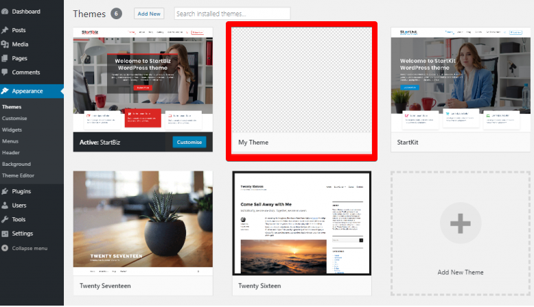
Activating the theme will give you a blank homepage. This is because your index.php template is empty.
- Moving on, you’ll need to change the background color of your theme. To do this, you’ll need to add a single rule to the CSS file that responsible for color change and then add a blank line after */ on the tenth line (*/ indicates comment closure). Now you’ll enter the following code.
* {  box-sizing: border-box;}
body {background-color: #f9f9f9;font-family: royalblue;}
The first entry is crucial when creating a responsive WordPress theme. The * in the syntax is a wildcard. It matches every single class in the HTML document.
In this case, it indicates that the final height and width of every single element on the page should include border, padding, and content. This is a rule that ensures that the padding is added inside the box as opposed to outside the box.
The second entry, on the other hand, is for changing the color of the background to white as well as set a default font that will be applied in the theme.
Step 4: Add Few Pieces of Codes
Before diving deep into the theme development process, there are some important pieces of codes that you’ll need to add your sidebar.php and function.php. These codes are added to ensure that your theme is flexible.
functions.php
- In your function.php file, add a CSS file by the name css. To add the file, insert the following code.
<?php// This function enqueues the Normalize.css for use. The first parameter is a name for the stylesheet, the second is the URL. Here we
// use an online version of the css file.
function add_normalize_CSS() {
  wp_enqueue_style( 'normalize-styles', "https://cdnjs.cloudflare.com/ajax/libs/normalize/7.0.0/normalize.min.css");
}
- Next up, you’ll need to add the following code in order to enable sidebar widgets on your admin control panel.
// Register a new sidebar simply named 'sidebar'
function add_widget_Support() {
  register_sidebar(
    array(
      'name'          => 'Sidebar',
      'id'            => 'sidebar',
      'before_widget' => '<div>',
      'after_widget'  => '</div>',
      'before_title'  => '<h2>',
      'after_title'   => '</h2>',
    )
  );
}
// Hook the widget initiation and run our function
add_action( 'widgets_init', 'add_Widget_Support' );
- Moving on, you’ll need a custom navigation menu. This will allow you to use the Appearance>Menu feature. To register a navigation menu, you’ll have to type the code below.
// Register a new navigation menu
function add_Main_Nav() {
  register_nav_menu( 'header-menu', __( 'Header Menu' ) );
}
// Hook to the init action hook, run our navigation menu function
add_action( 'init', 'add_Main_Nav' );
- Now Save and close the file.
Sidebar.php
Any widgetized area in your theme is called a sidebar. Including a sidebar ensures that your users can add content through the widgets admin panel or the customizer. To load a get_sidebar() template, insert the following source code on the sidebar.php file and save.
<?php if ( is_active_sidebar( 'sidebar' ) ) : ?>
  <aside id="primary-sidebar" class="primary-sidebar widget-area" role="complementary">
   <?php dynamic_sidebar( 'sidebar' );?>
  </aside>
<?php endif; ?>
Step 5: Create a Layout for Your WordPress Theme
At this stage, we’ll build a layout for our theme. To achieve this, we will use the media queries to modify the header.php, footer.php, index.php, style.php, page.php, and single.php files.
header.php
The header.php file defines the entire top area of a website. The header.php file should have the following parameters.
- DOCTYPE Html – this declaration informs your browser how the document should be interpreted.
- Language_ attributes – this function displays the language attributes for the Html tag.
- The <head></head> elements – these are html head elements where your meta data. These elements can also appear as <title></title> tag, <link></link> tag, <meta></meta> tag, bloginfo() functions, and the wp_head() action hook.
- The body_class function: it gives the body element the standard CSS classes as set by WordPress.
- The wp_nav_menu () – this function displays a navigation menu. Simply stated, it enables the drag-and-drop menu building interface.
Meta tags
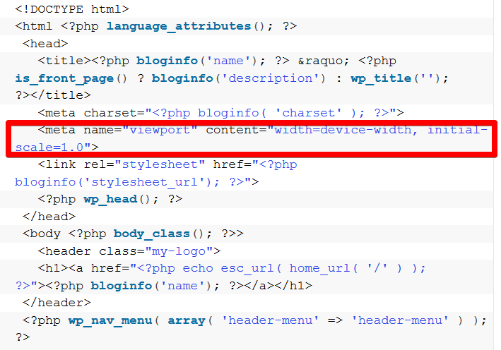
Remember that our intention is to build a WordPress theme with a responsive design. So, to ensure that your website adjusts automatically to different screen sizes and has cross-browser compatibility, you’ll need to add a meta-tag below your title.
The syntax for the meta tag should appear like the one below:
<meta name="viewport" content="width=device-width, initial-scale=1.0">
Once inserted, your website should be able to adjust to different screen sizes and viewports. So the final code should look similar to the one shown on the screenshot below.
index.php
This is a PHP file used to control the HTML and general output data on your homepage. It is, therefore, required by all themes for default layouts when particular templates such as page.php and single.php are missing.
To ensure that the header, footer, and sidebar codes are included on your homepage, it is recommended that you use template tags. You’ll also be required to insert various HTML5 semantic elements such as <main>, <header>, <section>, and <article>.
Another important element you’ll need to use is the WordPress loop in order to display post content. Therefore, the final loop will have the following template tags.
- <?php the_permalink(); ?> – this tag outputs the URL of the post.
- <?php the_title_attribute(); ?> – its shows the exact title of the post with regard to the link.
- <?php the_title(); ?> – displays the post’s title.
- <?php the_author(); ?> – shows authors name.
- <?php the_excerpt(); ?> it auto-generates the excerpt of the post.
So, the final syntax on the index.php file should look like the one below.
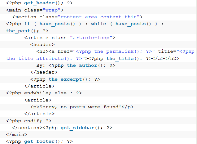
Now save the file. You should be able to see a plain page of your website once you reload your site.
footer.php
The footer.php file defines the lower area of your site. This file closes any tags open from the header.php such as the <html> and <body> tags. Without a footer.php file, you’ll notice some elements are missing such as the admin bar.
To ensure that the footer.php is not missing, use the <footer></footer> HTML5 semantic element. Keep in mind that for any JavaScript or WordPress code to be added, it must have the wp_footer () action hook. Saving the footer.php file ensures that all open HTML tags are closed.
Here’s how it should look like.
<footer><p>Copyright © 2019</p></footer><?php wp_footer(); ?></body></html>
single.php
Single.php is a generic single post file. It defines the layout of a single post on your site. In this post, we will use the “the_content” function in the code for you to understand how the full post will look like.
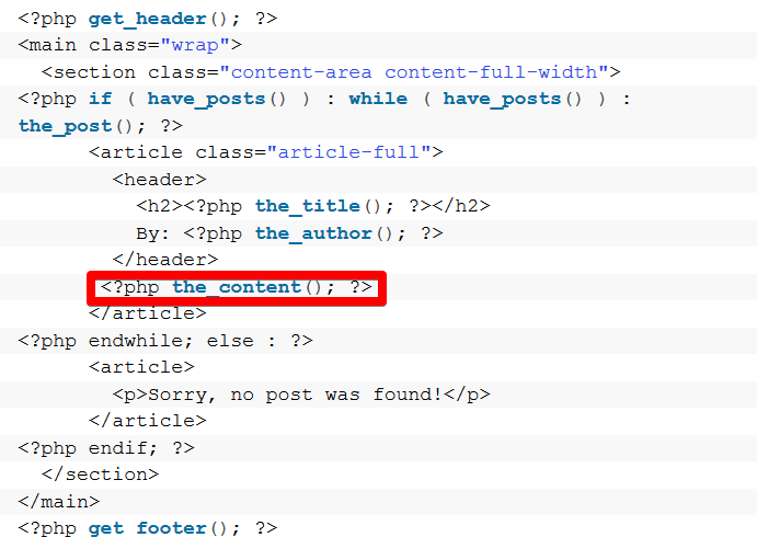
On saving the single.php file, your page should show as a single page.
page.php
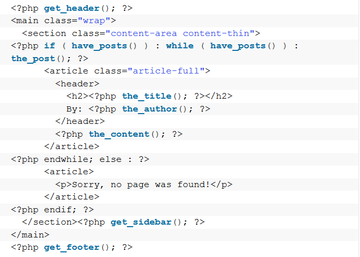
This file dictates how pages are displayed. Keep in mind that if the page.php file is missing, the index.php file is used.
Unlike with the single.php file, we will add a sidebar in the page.php file. This is to ensure that the variation is more visible. To modify the page.php file, add the following code.
style.css
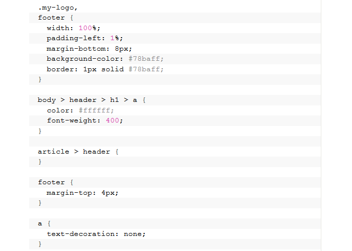
This is the main style sheet template on your WordPress theme that describes how elements written in HTML are to be displayed on the screen. It simply aims to control the layout and the design of your website.
You can add the following lines to see how your theme responds to various CSS styles and widths.
If you’ve followed all the above steps, you should have all the required templates and style sheets for your new WordPress theme.
Typically, you may want to beautify your theme. To do this, you’ll need to modify the CSS file further by adding animations, images, and other content.
However, you may be required to have some basic knowledge of PHP and HTML. Fortunately, with a WordPress theme generator, you could be able to achieve this without having to write a single line of code.
5 Template Tags, Loops, and Action Hooks: How They Integrate With WordPress?
Template tags
These are PHP functions that are used within themes to pull content from your website’s database into your theme. The content could be anything from a complete sidebar to a blog title.
They are preferred because:
- They are able to divide the theme into small sections that are easy to understand.
- They are easy to use when dealing with multiple theme files.
- It can display and generate information dynamically.
For example, the get_footer () tag communicates with WordPress to get the footer.php file and include it in the current theme file. The same applies to the get_header() tag.
There are numerous template tags such as:
- the_title() – tells WordPress to get the title of post or page.
- Bloginfo(‘name’) – get the blog title from the database
The WordPress Loop
This is a PHP code that’s used in WordPress themes to display a list of requested posts on a web page. The loop is indisputably one of the most significant features in WordPress. Without the loop, it would be impossible to query the database or display your content.
As such, the loop is found in every template file in your theme. This is one of the main reasons why it’s called a loop because it keeps repeating itself until there is nothing left to display.
Action Hook
Action Hook is a custom PHP function provided by WordPress. It’s defined in your theme (or plugin) to respond to specific events taking place in WordPress. These events include screen display, theme changing, and publishing a post.
Almost all WordPress themes have three action hooks built into them.
These include:
- wp_head () – this function is included in the head section of the theme. It allows you to add styles, scripts, and any other necessary information. In your theme header, calling the wp_head () action hook calls the do_action () function in the core code.
- wp_footer () – this function is included in the footer section of the theme. It allows you to add styles, scripts, and any other necessary information before closing the body tag of the HTML document. Just like the wp_head, calling the wp_footer calls the do_action function inside the core files.
- comment_form – this action hook modifies the design as well as the fields the existing comment forms.
6 Wrapping Up
As you can see, creating your own custom WordPress theme from scratch is not an easy task especially if you are a beginner. However, with the basic technical knowledge, you will find the process to be easier done than said.
As a quick recap let’s take a quick look at some of the things you need to do to build a responsive WordPress theme:
- Set up a local environment by installing WAMP or Desktop Server.
- Create a folder for your theme and give it a unique name.
- Create the necessary files.
- Edit the files by modifying the codes and then test the changes.
- Create a layout for your theme.
- Don’t forget media queries and meta tags for responsiveness.
Breaking down the process makes it easy. We hope that this tutorial will come in handy as you prepare to build your first responsive WordPress theme.


