“Create more content.”
“The more quality content on your site, the better!”
“Content is king!”
How many times have you read something like that?
Now don’t get me wrong…
Content is vital for any website, so it is indeed King.
But there’s a problem here.
For most of us, when we hear that, tend to think that is all we need; we think content is all it takes.
So when we start our WordPress blog, we get right to, well… blogging.
We post often.
We write as much content as our little heart can muster.
We publish that content and we see spikes in traffic on those days — which is exciting!
But perhaps, after some time, you look in your Google Analytics and you notice that your bounce rate is high.
People aren’t sharing your content on social media.
And your subscriber list is nowhere near where you think it should be.
These types of problems are not small issues.
Studies have shown that more than 70% of your site visitors that don’t convert will never come back to your site.
If you’re not converting and your bounce rate stays high, then any content you create is a going to start being meaningless in a lot of ways.
So what’s going on?
How do you change this problem?
There are a few things that might lend to it, but one that few even think to consider is this:
Design.
Why Design is More Important Than You Might Realize
Wait…
Design?
How does design factor into this when content is all I need?
That last question right there is the flaw to many people’s thinking.
Content is not all you need to get people to stick around and sign up.
Nope.
Creating valuable content is only part of the equation.
Design is the other side to it.
And it plays a large part in keeping people on your blog.
You can think of it like this:
Content is King; Design is its throne.
It’s a rather strong visual with you think about it this way.
A throne can say a lot about a King and it often serves as a foundation for the way people would view him.
Design has a similar effect.
Poor design makes people not care enough to stick around.
A good design makes people pay attention and view you with a certain authority.
Now when I say design…
I’m not talking about colors and logos or branding.
I mean the smaller, seemingly unimportant elements to a site that help to keep people on your site longer, keep them engaged, and that boost conversion.
I’ll be getting into some of these things to consider for your design, but I really want to drive home why they’re something you should be considering.
Google’s Push for Better User Experience (UX)
2015 was full of some rather important updates to Google’s ranking algorithm.
The most notable one being the one that sparked, Mobilegeddon — Google’s push to make sure sites began using mobile-friendly sites if they wanted to be rewarded in mobile search.
Since then, other algorithms and updates have taken place. But if there’s one thing to take away from all of these, it’s this:
The user. For the love of God, think of the user!
Google provides the internet as a service to its users.
As a service provider, they want to give users the best experience possible so that people don’t go searching for a better search engine.
That means that they want websites they show in top search results to hold users in the same high regard and provide them with a better online experience.
Therefore, user experience is vital. The better experience you provide and the closer you stick to Google’s high standards, the more likely you are to convert and help you SEO endeavors.
UX is something that starts at a website’s foundation and throughout its design.
By utilizing better UX on your site, you’ll not only make Google happy but you’ll also help make your visitors happy.
Now here are a few things to help you design a site that makes your users rejoice.
3 Important Things To Keep in Mind When Designing a Blog
Your Theme Should Be Made With SEO in Mind
We all do what we can to help with SEO on our site.
We use keywords.
We optimize title tags.
We compress images and add alt text.
The list goes on and on!
But if your theme is not built with SEO in mind, then you’re going to feel like you’re holding a balloon with rock tied to the string.
So how to do you pick a theme that is SEO centric?
Here are a few things to help you.
- Pick a Theme with Schema Markup. The technical term Schema Markup simply means that a theme is neatly coded so that Google can read your content quickly and in a way that can be rewarded. This also helps you site run faster — an important ranking factor in Google. Not sure where to find a theme? Here’s one to consider.
- Make Sure Your Site Loads Quickly. PageSpeed is vital. The longer your site takes to load the less likely people are to stick around, and Google won’t reward your on-page SEO if you provide a slow service to its users. Some designs can add code bloat that causes a page to load slow. If that’s the case, then it may be time to switch themes.
- Your Theme Should Be Responsive. This probably goes without saying, but I’ll mention it anyway. Your theme needs to give users a good experience on mobile screens. Switching to responsive WordPress theme will give you thumbs up across the board.
Make Social Sharing As Easy as Possible
Contrary to popular belief, social sharing is good for SEO. And even if it wasn’t, getting your content out into the world on big platforms like Google, Facebook, Pinterest, Twitter, StumbleUpon, and other ones is smart to do.
All of those platforms help draw your potential audience in.
However, you can only do so much by posting on these platforms on your own.
Your biggest strength in social sharing is leveraging your current audience to share your content for you.
But this is easier said than done.
Obviously, providing sharable content with relevant images is important. But the other side of this is making it both easy and tempting for your current audience to share your stuff.
Themes like SociallyViral are built with social sharing in mind to help your content get shared more easily.
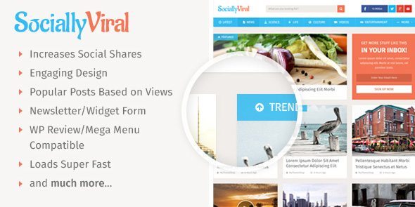
This theme does so well, that some people who use it for their sites now make millions!
No joke here.
Ever here heard of ViralNova?
That site is built on the SociallyViral theme and has a net worth of $100 million!
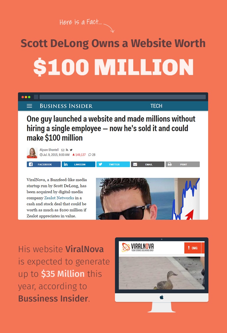
Though much of the site’s success had to do with the work put into it, you can be sure that having a theme that was fast, responsive, and built around promoting social shares helped quite a bit.
Opt-ins are a Must. Use them!
No matter what your feelings are about email pop-ups, the fact is this:
They work!
Leaving well-placed opt-ins out of your design is going to hurt your overall strategy when building an email list.
We sometimes don’t factor these in when it comes to design, but we really should.
Remember:
We want to give our users content that can help them.
When you use an opt-in and exchange an email address for a high-quality PDF, ebook, worksheet or something else you think they would find helpful, you are providing them with a better experience on your site.
This, in turn, helps present you as an authority that people can keep coming back to and a voice that they can trust.
There are plenty of opt-in plugins out there. Each one
Each one does something a little different.
The one thing I love about WP Subscribe Pro is how easy it is to change the colors to match my brand and how it doesn’t add messy code to my site that would slow it down.
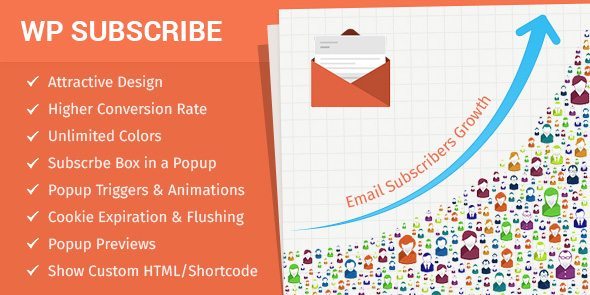
This plugin works great with all WP themes and the shortcode option is great for placing content upgrade in your site to boost conversion.
Wrapping It Up
Yes, content is, in fact, King.
But it takes more than just good content to make your site do well.
The design is important, too.
And design starts with a good theme that is built with conversion and SEO at its core. When you pair this to your website and content strategy, you’re making your life much easier.
You should always go for Premium WordPress Themes as they are schema enabled and load fast to deliver the content instantly to the users.
What design factors do you think play a role in a site’s success? We’d love to hear your comments below.

