Are you looking for the top examples of sites made with Salient WordPress theme?
Then your search ends here.
Table Of Contents
- 1. Manifesto
- 2. Lion’s Share Digital
- 3. Rappers I Know
- 4. Gravual
- 5. Boost Audio
- 6. Pedro Gaspar
- 7. EggPlain
- 8. Phobiahz
- 9. Bear Cotton
- 10. Another Love Story
- 11. Launch Effect
- 12. Painted Pixel Studio
- 13. The Sleep Lady
- 14. Retroyspective
- 15. Camp Timberlane
- 16. Bryce Cooley
- 17. Acroweb
- 18. Bravr
- 19. Visual Working
- 20. Gavin Ask
- 21. Wrapping Up
In this article, I’ll list all the example sites that are currently using Salient as their primary WordPress theme.
I have covered a wide variety of niches that use this theme so that you can take it as an inspiration and create your beautiful looking site.
I hope by now you’re super excited to design your site.
So without wasting any further time, let’s dive right into the article.
Review & Top 20 Examples of the Salient WordPress Theme
1 Manifesto
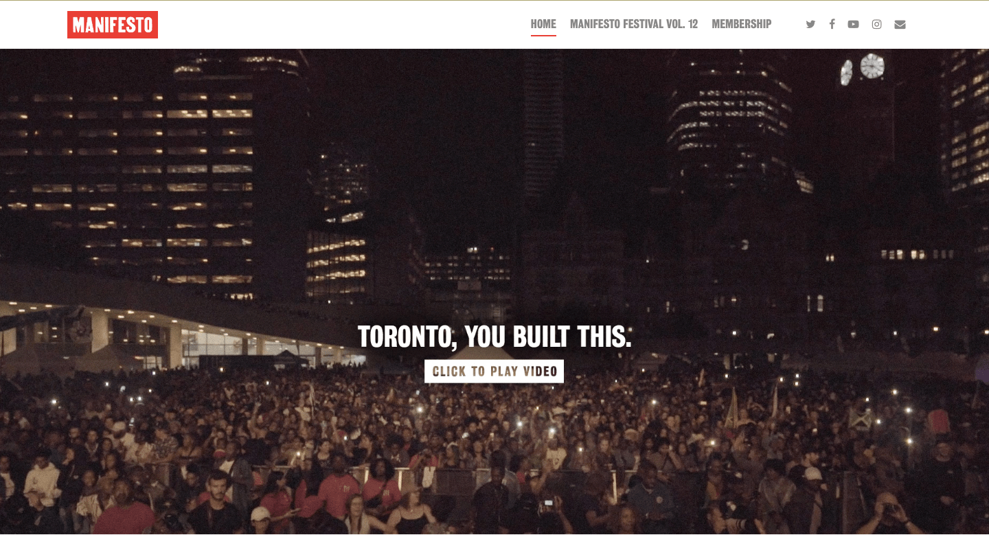
The Manifesto is a festival organized in Canada Toronto for young artists, and media groups. The event takes place for over a decade.
The success behind this festival is the online presence they have. In that, the sites’ look and feel play a significant role.
On the homepage, you have a beautifully portrayed video that shows you how the event has grown together with people’s support.
The entire site is filled up with only three colors (black, white & red) giving it a bold and authoritative look altogether.
There’s a beautiful image slider which shows you different aspects of the festival.
They have cleverly shown the total number of attendees and artists who played a major role in making this festival possible.
Lastly, they have a beautiful looking live map location with a black background that entirely matches the brand colors. Oh, and did I mention you also have social media icons at the bottom of the site which is a feature available in the Salient WordPress theme.
If you click on the “Membership” button, you see a beautiful loading icon that instantly loads the page thanks to the fast loading Salient WordPress theme.
All and all the website design looks sleek and crisp. Even at one glance, you’ll start to feel positive vibes that come from Manifesto.
2 Lion’s Share Digital
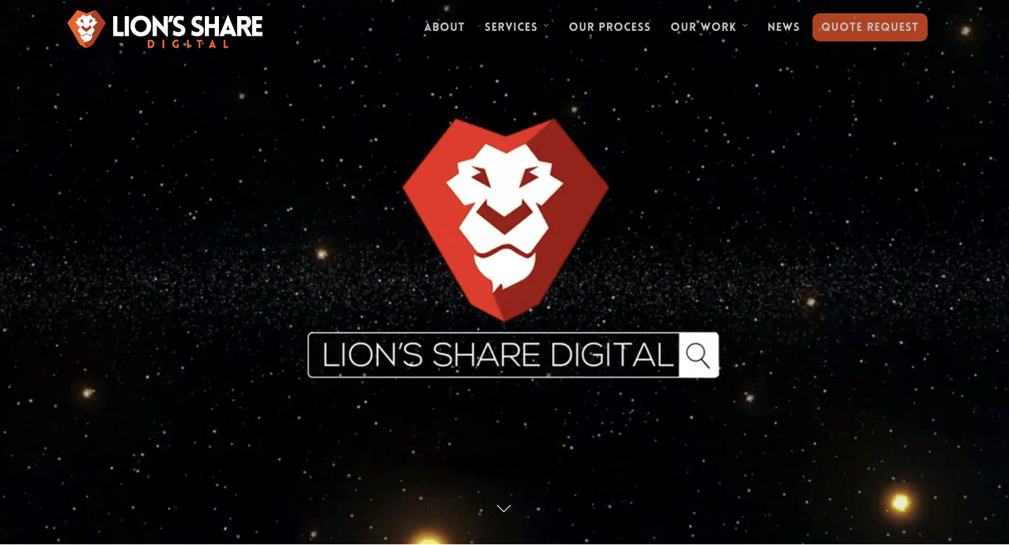
Based in Austin, Texas Lion’s Share Digital is a web and design firm that showcases the true art of creativity on their website.
Right on the top of the homepage, you see a fantastic background video running with nice matching animation effects. There’s a clean looking menu populated with options that come integrated into the Salient theme.
Next, as you scroll down, you see a beautiful area on what all projects they have worked on. On hovering, you see the name of the project in a brilliant looking orange box.
They don’t want their prospects to juggle around the website and find what services they offer so they have nicely put all their services on the homepage mixed with built-in icons present in the Salient theme.
All the unique elements that you like the clients’ section, service section is all made with the built-in Salient page builder visual composer.
If you click on the “Get Quote” button, you are presented with a sleek looking query form which again is built using the visual composer.
The overall design of the website is simply exceptional and truly modern. Lion’s Share Digital shows you us the real power of the Salient WordPress theme.
3 Rappers I Know
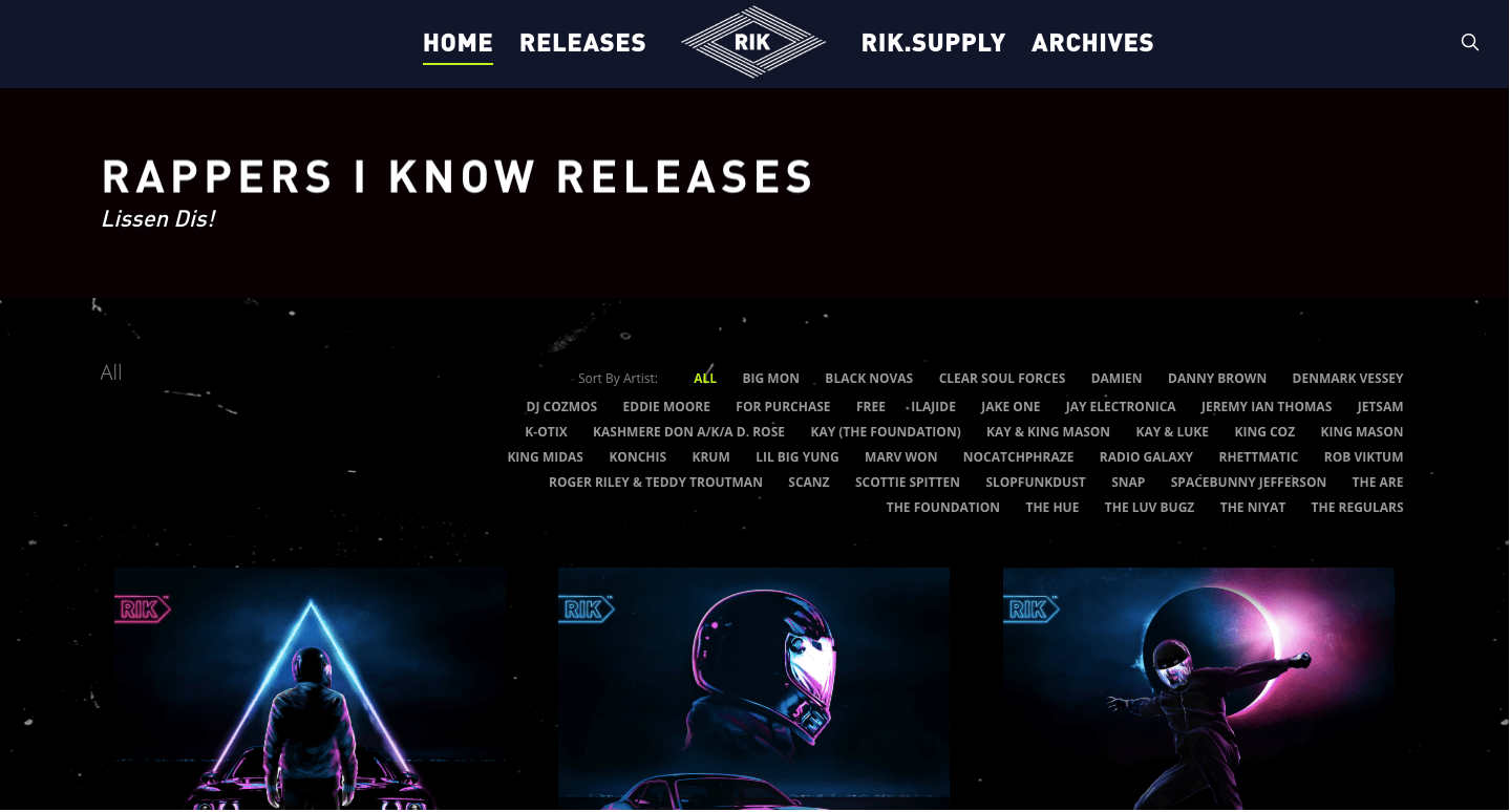
Started in 2005 Rappers I Know is an online boutique music label and an online shop that sells stuff that resonates with rappers.
With a complete black layout, it’s a simple-looking website. They have boatloads of rap tracks loaded on their homepage which has a beautiful looking animation effect when you hover over it.
If you click on any of the raps, you’ll see a complete music system with cover images and option to buy the song all of which is done using the Salient page builder.
From the top menu bar if you click on the supply tab, you’ll see a page with a beautiful looking bold “Shop Now” button. Clicking on it you have an entire store of t-shirts and hoodies, bags and many more all made up with the help of WooCommerce integrated with Salient WordPress theme,
In the footer of the website, they have perfectly sized social media icons that match with the black background and a clean looking copyright text.
The text on the entire site is very bold and all caps which give the whole site a funky type look. If you’re into music or rap, you’ll start to feel the vibes as soon as you visit the website.
4 Gravual
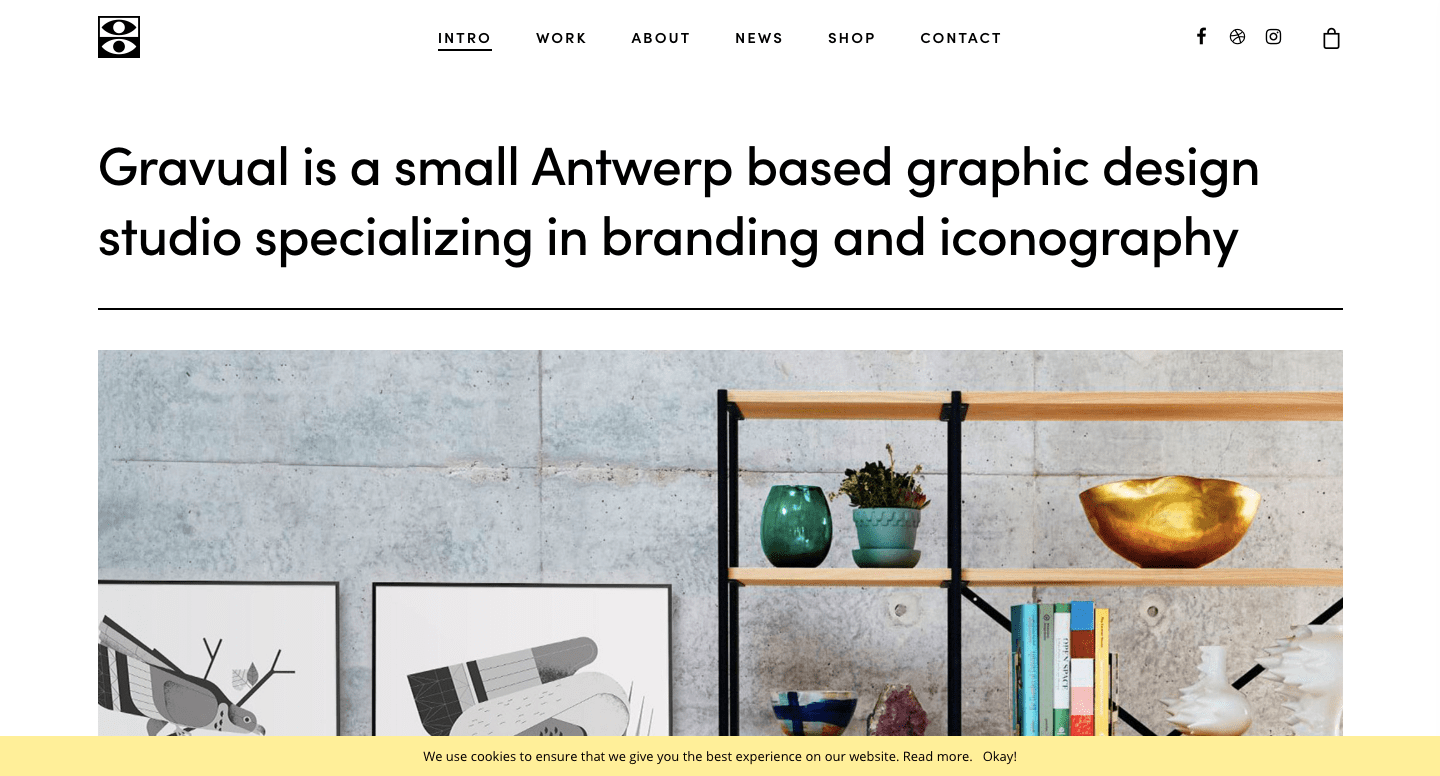
Gravual is a full-fledged graphic design studio that specializes in branding and iconography. If you look into every minute detail while designing creatives and logos for your brand, you’ll love them.
The other reason to love them is the way they have designed their website. With a white background mixed with black text gives it a premium look. The overall design of the site is minimalistic still looks fantastic.
On the top of the homepage, you have the Salient massive image slider followed by three boxes with beautiful animations where there’s social media handles, contact information, and projects they are currently working on.
After which you see a whole bunch of beautifully organized images which is their previous work showcased on the homepage. Right after it, we have the latest news in two formats which gives the site a different look.
Lastly, you have the Instagram feed which is a built-in feature of Salient WordPress theme followed by a purely black background footer with mild white text.
I loved the design of this site and it’s hard for me to believe that it was created on top of the Salient theme.
5 Boost Audio
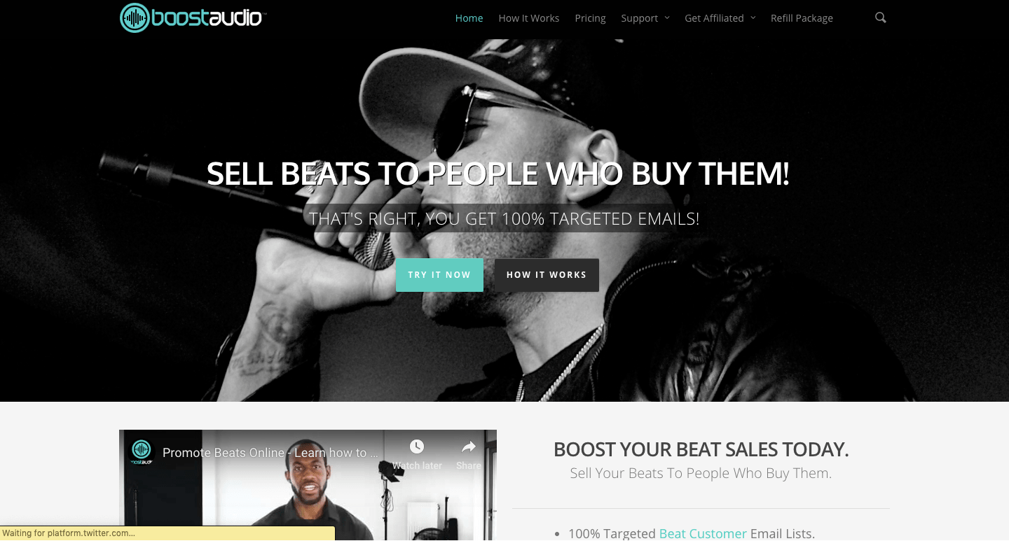
Boost Audio is a unique concept that sells high-converting email ids of beat buyers. If you have a beat to sell or are looking to increase your fan base, you might need their service.
The homepage of the site is very small which includes a static image at the top, next you have a YouTube video with a nice looking CTA.
If you check the pricing page, you have a cool looking pricing table that you can be made using the Salient page builder.
The Affiliates page has a coming soon page which of course they made using the page builder.
Lastly, in the footer of the website, you have a site description followed by social media icons.
I loved the mix of the black background with light green colored buttons and white text on top of it. They are maintaining a color-flow with the help of unlimited color options available in the theme.
6 Pedro Gaspar
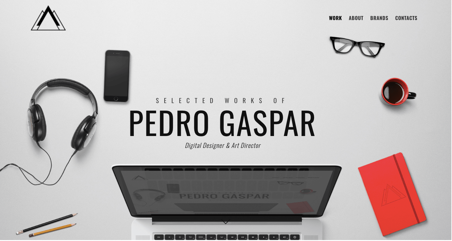
Pedro Gaspar is a website of an individual UI/UX designer who is famous for creating motion graphics, editorials, digital design, branding, and advertisements.
Just by looking at the website, you’ll fall in love with it. It has one of the best designs I have ever come across in a WordPress site, all thanks to the Salient theme.
It’s hard to believe that it’s made on the WordPress CMS. On the homepage, they have a wonderful graphic image that displays the name of the site owner. Right after it, you see his work and apart from this, there’s nothing found on the homepage. It’s clean and simple.
The About and Brands page of the site is where the real fun begins. In the About page, you can notice a perfect usage of icons and buttons with matching text.
The Brands page has a beautiful animation effect and a boxed style format where you can see all the brands for which the designer worked for. In the Contact page, you have the normal contact form and on the right, you have black social media icons that you get with the theme to use directly on the site.
This site left an everlasting impression on me due to color combination and the site design and that’s all because of the WordPress Salient theme.
7 EggPlain
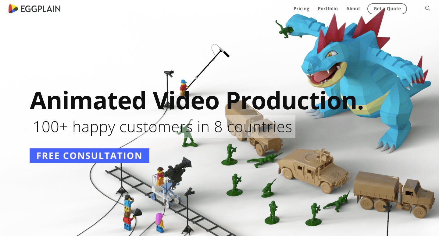
EggPlain is an Animated Video Production company that has clients in over eight countries.
Right after you land on the website, you see a cool looking dinosaurs picture with a bold black text made with the help of static image feature in Salient theme.
On scrolling down, they have a good collection of their work to showcase in an organized box-like format. They have also shown who all their clients to build social proof and authority in the niche.
I liked how they have cleverly used a mix of font styles with the help of available fonts in the theme.
With the help of the Salient page builder feature they have divided the site into a block of sections like FAQs, get a quote, client testimonials, and more.
They didn’t restrict themselves with one or two colors and have used a wide variety of color options on their homepage.
The Pricing page has three wonderful looking tables that are made using the pricing page builder element. Lastly, the footer has the site description and social icons in the bottom right corner of the homepage.
I loved how they have mastered the art of designing their website with the help of a powerful WordPress theme Salient. The site is an inspiration for anyone who wants to design their WordPress site.
Similar themes: Best Podcast WordPress Themes
8 Phobiahz
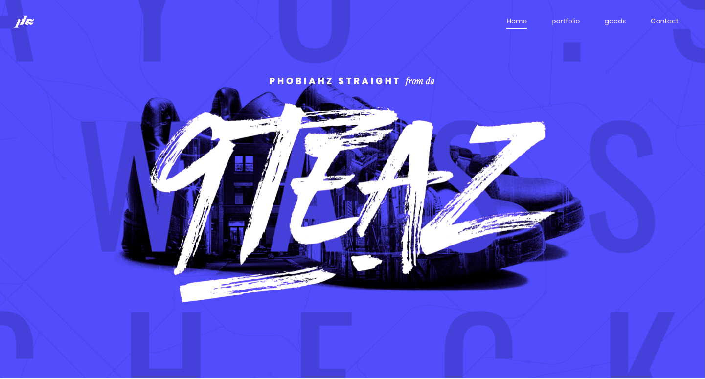
Phobiahz is a graphic design website by a freelancer designer who is selling his designs online.
If you analyze the look and feel of this site, you’ll feel it’s custom coded. However, that’s not the case as the site owner has used the Salient theme to create this website.
If I talk about the color combination, it’s a unique mix of black & blue color with a bold white text on it.
They have used a bold white text static image at the top followed by some portfolios with a moving parallax effect.
The menu is kept super simple that anyone can easily understand it. The theme is completely made using the advanced page builder Salient theme features and also some external third-party font plugins like Google Font or any other ones.
The footer has a cleverly used call to action button with social media icons ending the homepage.
For anyone who is a freelance graphic designer can find a lot of inspiration from this post and create the same structure with the help of the Salient theme.
9 Bear Cotton
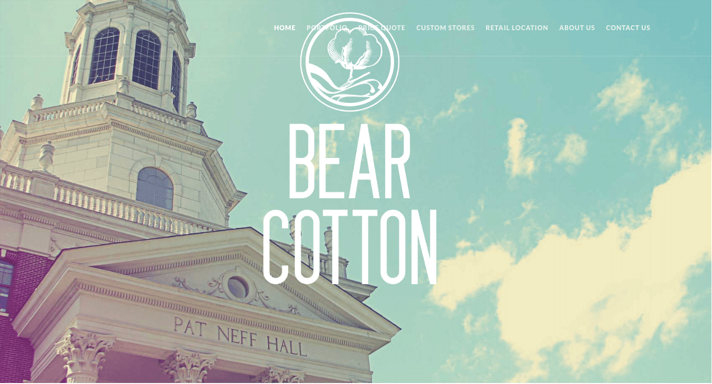
Bear Cotton as the name suggests is a custom made t-shirt apparel company.
The design of the website is very simple but still manages to look perfect. On the homepage, you have bear cotton branding cover by a good looking static image.
In the next section, they have showcased what they do and how are they serving their clients. The site owners have made use of Font Awesome icons and listed all the features of their product.
After which you have the typical looking portfolio design which you’ll find the Salient WordPress theme. Although it is simple in design, it converts well and is proven to work.
The page ends with a bland looking footer section. On the Custom Store, Price Quote & Contact Us pages they have made use of the default contact form that comes with the built-in page builder.
They have used the map element from the page builder in the Retail Location tab.
If you run an apparel store, Bear Cotton is a good way to get design ideas for your website.
10 Another Love Story
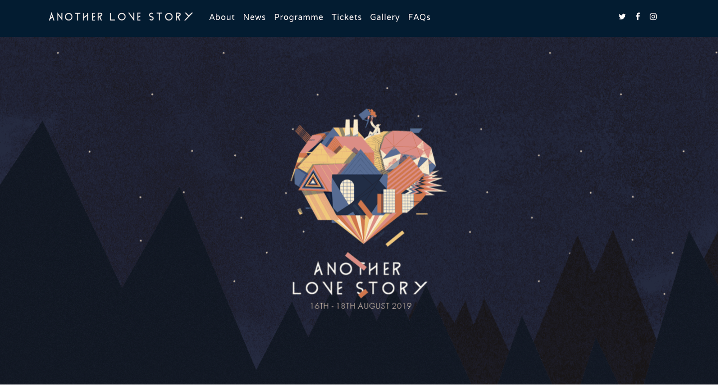
Just like Manifesto, Another Love Story is a music and art festival.
The site has one of the smallest homepages I have ever witnessed. There’s a beautiful effect that makes the screen move as you move the mouse and it ends with an animated purchase tickets button.
If you explore the About page, they have a cool page format where there’s text on the left side of the page and video and an image on the right, which they have achieved using the built-in page builder.
While hovering over the menu tabs, you see a subheading menu which is rare to be found in normal WordPress themes.
On the tickets page, they have a complete booking system where you can book the tickets for the event. The ticketing system is integrated directly with Eventbrite.
The Gallery is filled with a lot of event photos and has a default Salient WordPress image style.
I’m quite impressed with the design and the creativity of this site. However, due to the usage of a lot of images, the site is taking way too much time to load completely.
11 Launch Effect
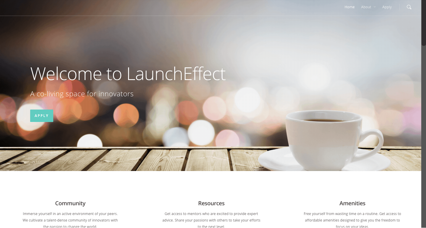
Launch Effect is a co-working space of a group of engineers and entrepreneurs based out of Houston.
As usual, just like other websites, they have made use of a static image at the top of the homepage with the default green colored CTA button.
On scrolling down, you can read what they do which is divided into three columns (an element in the built-in page builder)
Next up they have divided the remaining pages with static images and moving videos covered by a strong looking white and bold text over it with a CTA button.
Lastly, on the homepage, you have the Google Maps embed which shows the offline location of their business.
They haven’t added a lot of elements so there’s not a lot to talk about this site. Nonetheless, they have done a pretty sweet job on the homepage of using multiple images and adding text over it to grab the users’ attention instantly.
12 Painted Pixel Studio
![]()
Painted Pixel Studio is a web design and Internet marketing company where you get services from local SEO to social media marketing, web development, and web design.
They have a brilliant rotating image slider at the top of the homepage that has a perfect mix of images that resonate with the text followed by a CTA.
On the homepage itself, they have given multiple reasons as to why anyone should choose their service. Now to portray that they have used content blocks available in Salient page builder.
The homepage also has a default captcha based contact form to keep spammers away from spamming the site. Furthermore, the website visitors can read the latest blogs published on the site with a text excerpt and a featured image.
The footer has nothing fancy in it. I mean it’s the common Salient theme footer with site description on the left and navigation links on the right.
I was shocked by how beautifully they have designed the “About” page of the site. They have used a lot of elements available in the page builder like progress bars, boxed content layout, client testimonials, and finally CTA.
Apart from that, the “Contact” and “Get Quote” page uses a similar contact form layout. One more thing I was impressed with is the drop-down menu with icons that come up while hovering on the menu.
All and all Painted Pixel Studio has a fantastic website theme that is sufficient to attract new clients easily.
13 The Sleep Lady
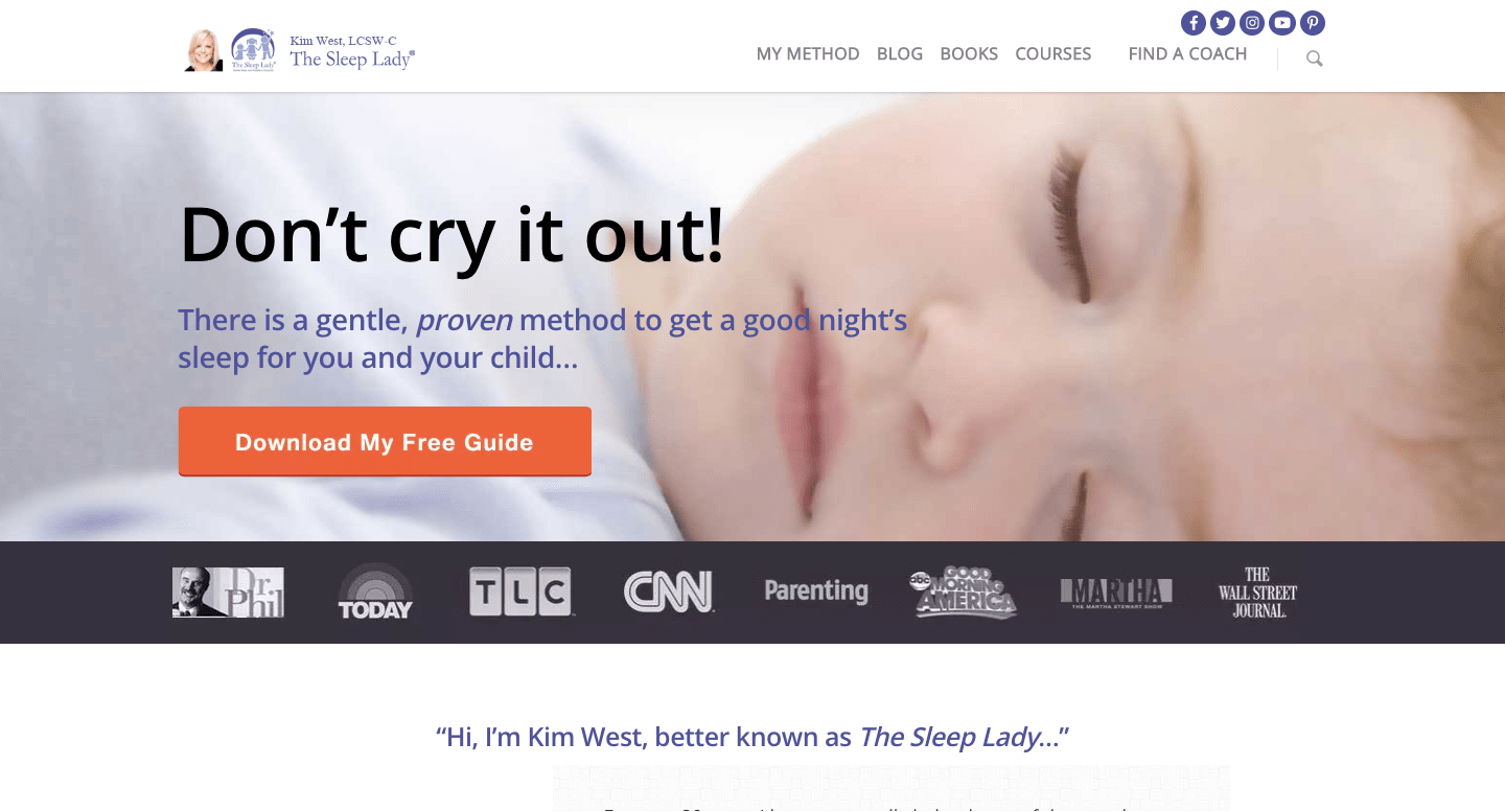
The Sleep Lady is a website run by an individual named Kim West, who is a Sleep Therapist for more than 21 years.
It’s a blog with a powerful homepage made to collect high-quality leads by offering a free sleep guide PDF.
Early on the homepage, you see a brief introduction of the site owner after which she has listed her products which she sells through her site.
Kim sells ebooks, courses and also offers personal coaching all from her website, all of which is made using the WooCommerce plugin integrated with Salient WordPress theme.
The course and ebook pages are well-built with a wonderful sales page with multiple page builder elements used like pricing table and context boxes.
The blog section of the site has newly updated fresh and informative content. The blog format is the default theme layout which everyone will get if they plan to go with the WordPress theme Salient.
Kim is strategically using the Salient theme to build an online shop and also share valuable content through his blog articles. If you have a blog and products to sell, this could be a great example to keep an eye on.
14 Retroyspective
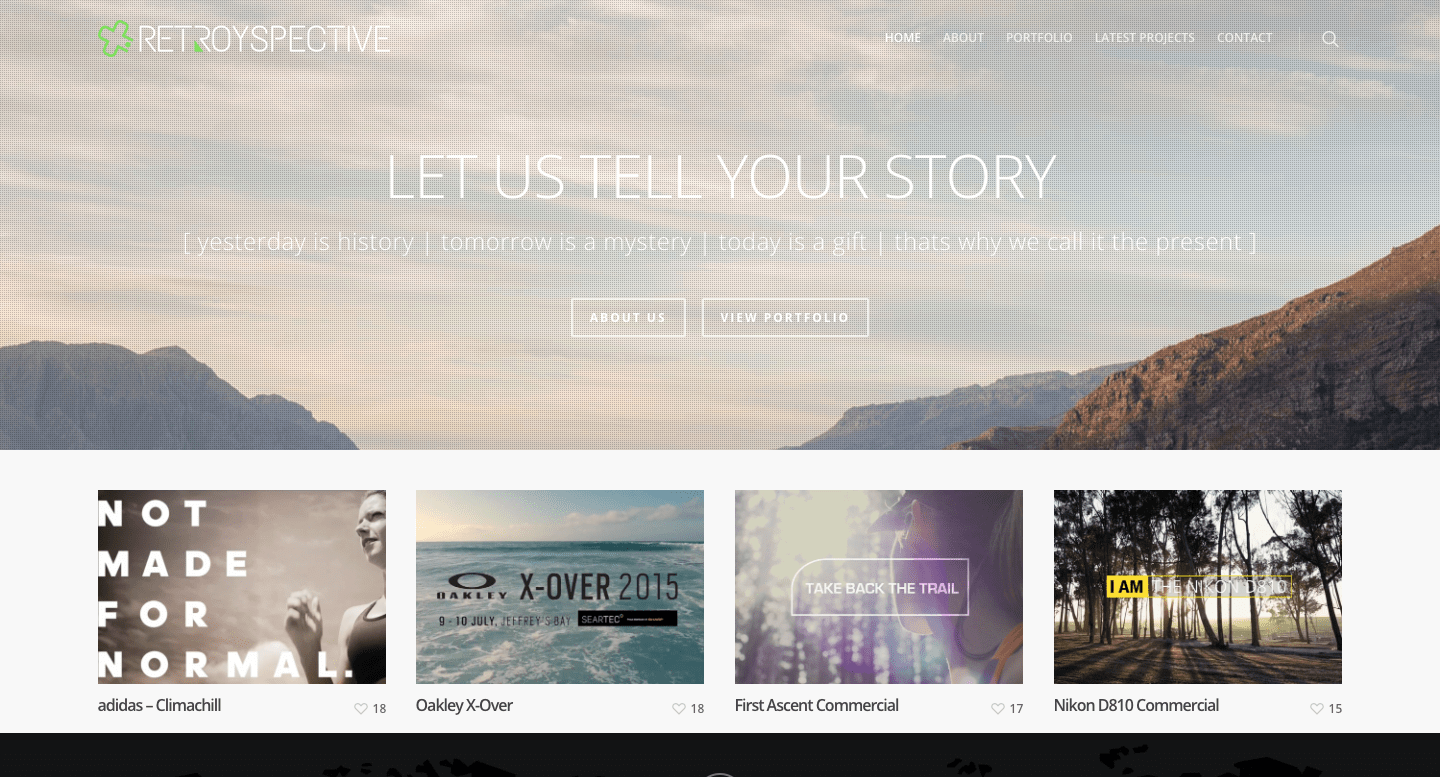
Retroyspective is a site run by a freelance video creator Troy Davies. They are majorly into creating cinematic experiences for your audience.
The site is created using the Salient WordPress theme which looks fantastic. At the top of the homepage, they have a static image with an action-driven text followed by two calls to action buttons – the ones available in the theme by default.
Following that, you have four sample videos lined in a row which has a beautiful green hover effect with a “Watch Video” button on it. It can be created using the Salient Page Builder portfolio element with a drag and drop builder.
The website loads super fast all thanks to the Salient theme fast loading speed and performance.
At the end of the homepage, they have added client testimonials which is an element present in the built-in page builder.
The site owner has used multiple other elements like contact form, progress bars, and other elements to make the site look modern and eye-catching.
It’s not necessary to have coding knowledge to create sites like this. Anyone and everyone can do with the help of the Salient WordPress theme.
One good thing about this website is, the site owner has focused a lot on branding elements and the overall color of the site. They have added green buttons, logos, hover effects, and progress bars to keep the flow for the visitors.
15 Camp Timberlane
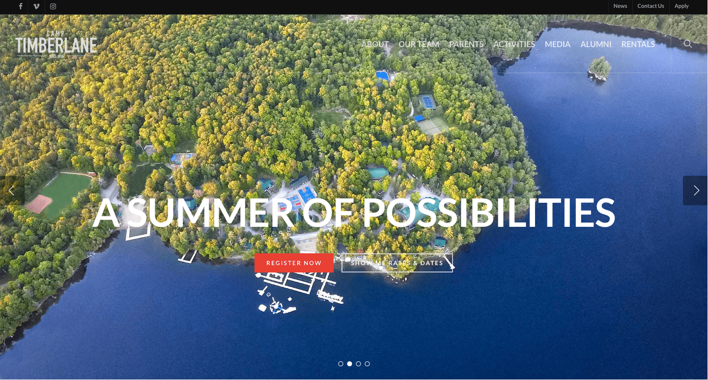
Camp Timberlane, as the name suggests, is a camping website. Started back in 1958, it’s a community of kids who want to learn new skills, connect with nature, and enjoy their summers to the fullest.
This beautiful site is made using the Salient WordPress theme. Surprisingly, they have used a lot of elements on the site still it loads super fast as the theme is highly optimized for performance.
Right on the top of the homepage is a collection of beautiful image carousel slider with two calls to action buttons. Next up is a video with a countdown timer to create urgency which is created using the various elements available in the Salient page builder.
As they deal with travel places, they also added their Instagram page to make their visitors aware of the places they visit. Again the feature is available in the Salient theme so you can add it too.
Lastly, there’s the footer area which is a bit different to what we have seen on other sites. They have added a weather forecast, with their address and some navigational links followed by the copyright text.
The colors on this site are used perfectly fine with a perfect blend of text with it. Also, if you hover over the menu, there’s a matching color submenu which has red navigational links.
All and all the site is highly focused on branding which they have achieved using the WordPress theme named Salient.
16 Bryce Cooley
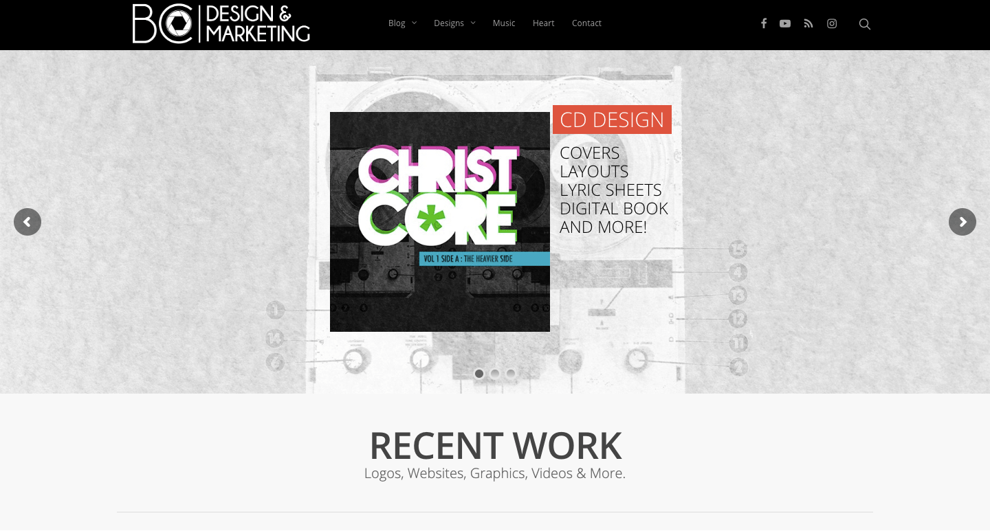
Bryce Cooley is a website created by an individual designer who designs logos, websites, graphics, videos, and more.
The site is minimalistic in design and is built on the Salient WordPress theme. Talking about the homepage, they have added the image carousel – these are moving images.
Next, as usual, you have work samples that have a enlarge hover effect. Shockingly, the site owner has added some link to blog posts which looks a bit off as there are no featured images to it. However, if you plan to use the same layout, you can use featured images to make it look more appealing.
In the “Music” tab they have added some of the music tracks with a good match of images over the list of tracks. Well, that is achieved using the simple and easy to use drag and drop Salient page builder.
On the right of the top corner, you see all the social icons which are the default layout that comes with the theme. Furthermore, there’s the dropdown menu too for the visitors to navigate the site properly.
17 Acroweb
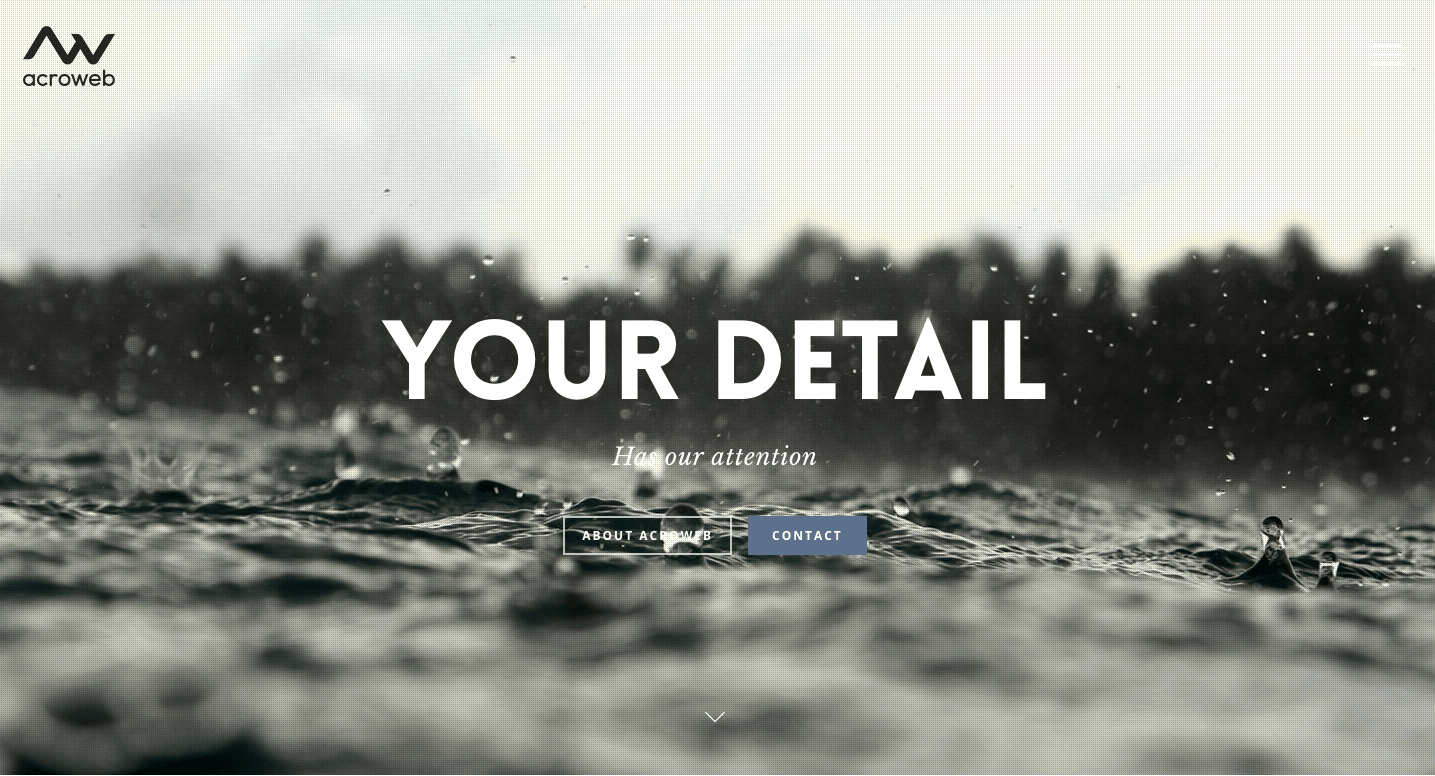
On opening on the Acroweb site, you’ll notice the beautiful loading animation that comes in the Salient WordPress theme.
Acroweb is a website development company that offers services like WordPress and Drupal development. Apart from that, they also have a website consulting service. The attention to detail of this site is worth mentioning.
There’s a beautiful dark background image at the top of the homepage featured with a meaningful text and two call to action buttons which is enough to make your stop for a second.
As you scroll down, there’s a nice parallax effect with the two columns left one having text and right with an image. Right after which they have added the services they offer their clients again in a column layout with a powerful CTA.
To showcase their authority, they have added the clients they have worked with or are working and finally to end things you have the contact form to get in touch with them with the office address on the right as the footer section.
I want to talk about the menu style on this site. It is a sideline menu where you click on the three lines and it expands with all the available options. It’s a unique thing that they have achieved with many header styles available in the Salient theme.
The developer of this website has used the 250+ templates that are available to use with this theme.
Overall, Acroweb is a great example to consider if you’re looking to build a site to sell services online.
18 Bravr
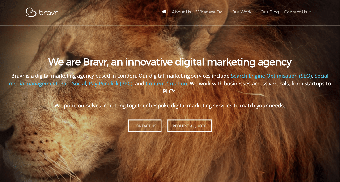
Bravr is a digital marketing agency located in London. They offer services like SEO, SMM, paid marketing, PPC & content creation.
They are using a high-quality video carousel in the background of the site with white text about what their company is all about with CTA buttons with cool looking animation effects.
Next, they have the services section where they have listed all the services and what they offer in detail which is made using the column layout available in the page builder offered by Salient.
Openly, on their homepage, they have also shared some of their client case study with images that will change into a button while you hover over it.
Lastly, in the footer section, there’s a short description of the site and some site navigational links.
If you click on the “What We Do” tab on the menu, you’ll be blown away by the dropdown menu which populates. The brand colors are used perfectly which shows that they are the authority in this niche.
If you ask me, the design is something unique with what I have seen
19 Visual Working
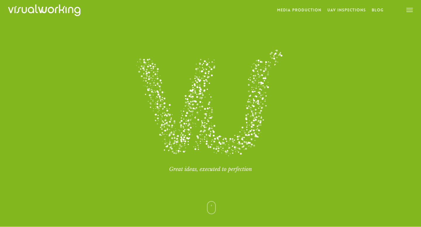
Visual Working is a production company that combines photography with a motion picture.
Honestly, the design of this site has truly amazed me. The videos, visuals, text, animation effects all add up and make it the best looking site on our list among all the examples of Salient WordPress theme.
The homepage has a video carousel at the top, followed by their services and the work they have done.
The team also frequently maintains the blog section where they share informational content with their audience.
Visual Working with their website design proves that they are creative people. The site has used a lot of videos all over the website thanks to the full-slider video carousels support in the Salient WordPress theme.
Every page you visit on the site has a completely different design which is made using the built-in page builder.
If you’re struggling to get ideas for your new website and you want to create a professional-looking site, this is the website you should consider.
20 Gavin Ask
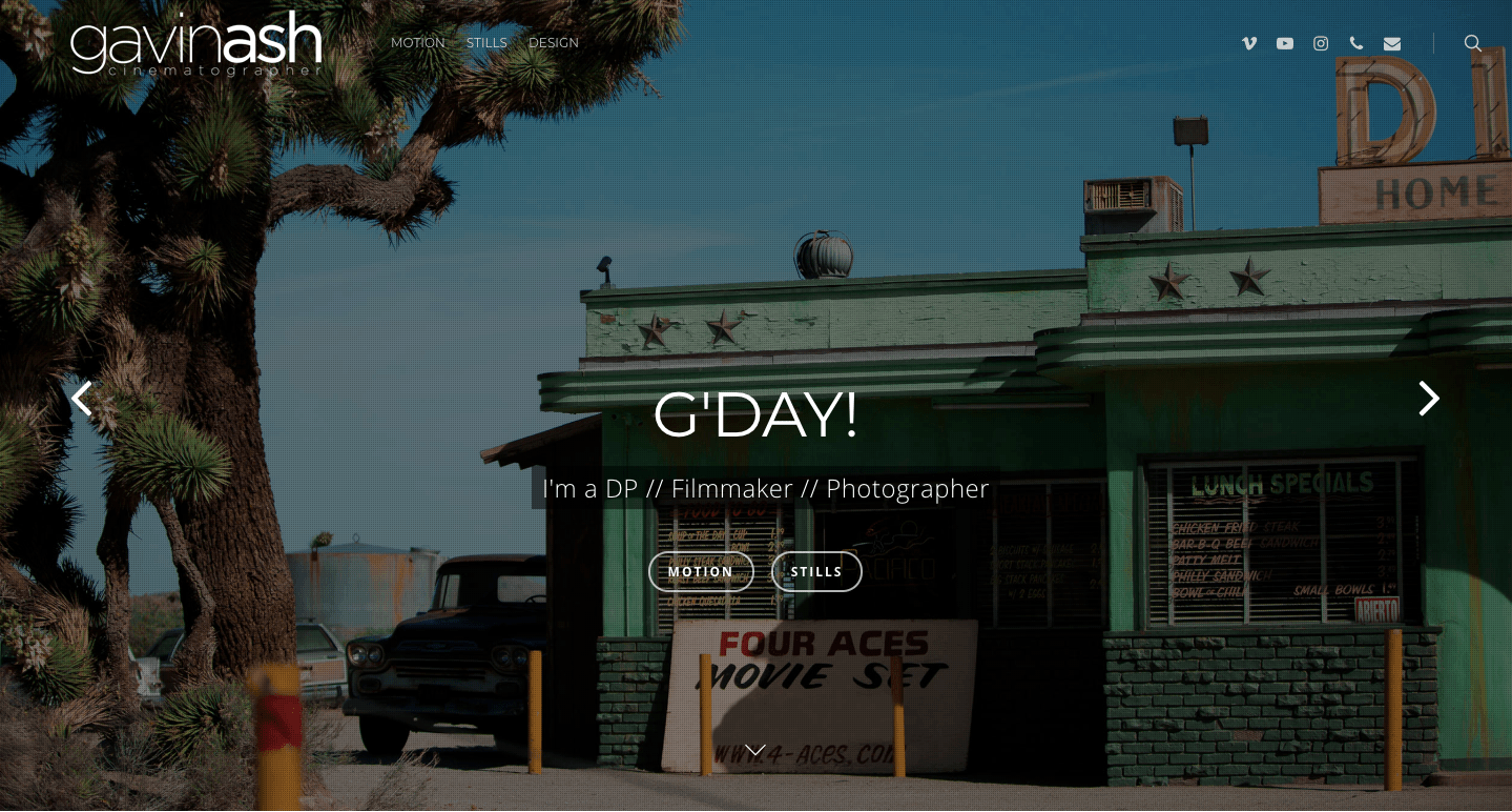
Gavin Ask is the last theme on our list of Salient WordPress theme examples. Gavin Ash is an Australian cinematographer based out in LA.
The site has a lot of elements combined with beautiful animation effects and parallax scrolling. The parallax scrolling has a video embedded in it too.
If you click on any of the navigation links, the loading effect present in the Salient theme will show up that too with fading animation effect which looks interesting.
While hovering on any of the samples and portfolio, it starts to move, which is a built-in feature available in the theme.
After Visual Working, this is the site I’m in love with. Amazing visuals and design elements are used to create this masterpiece.
For all the videographers, you can consider this as the one-stop solution for creating a jaw-dropping website design.
Wrapping Up:
Designing a WordPress site is an art that not everyone can master. The sites listed here are some of the best of the best designed with Salient WordPress theme.
No matter what niche you operate in, you can take design inspiration from all the 20 examples of Salient themes.
If you have more samples for us to add in this list do drop the links down below in the comments.
Do let us know which is your favorite design and what did you like about that theme?
